

BIG SKY FITNESS
LOGO
BRANDING
Big Sky Fitness is a small chain of gyms with five different locations in Connecticut.
This student project tasked me with exploring a rebranding of this organization.

I focused my Big Sky Fitness rebrand around Atlas, the mythological Greek titan who is famous for holding up the sky. I felt he was the perfect figure to represent strength and to encourage those who work out at the gym, while staying relevant to the pre-established sky branding.
Current Branding
Personally I felt that leaving ‘fitness’ out of the title, paired with the logo, and font failed to communicate this was a gym. The square gradient does not work as a mark and does not make for a memorable logo.
Big Sky also sells their own shakes. This is Big Sky Blendz which has its own logo. This addition further clutters their branding.

New Branding
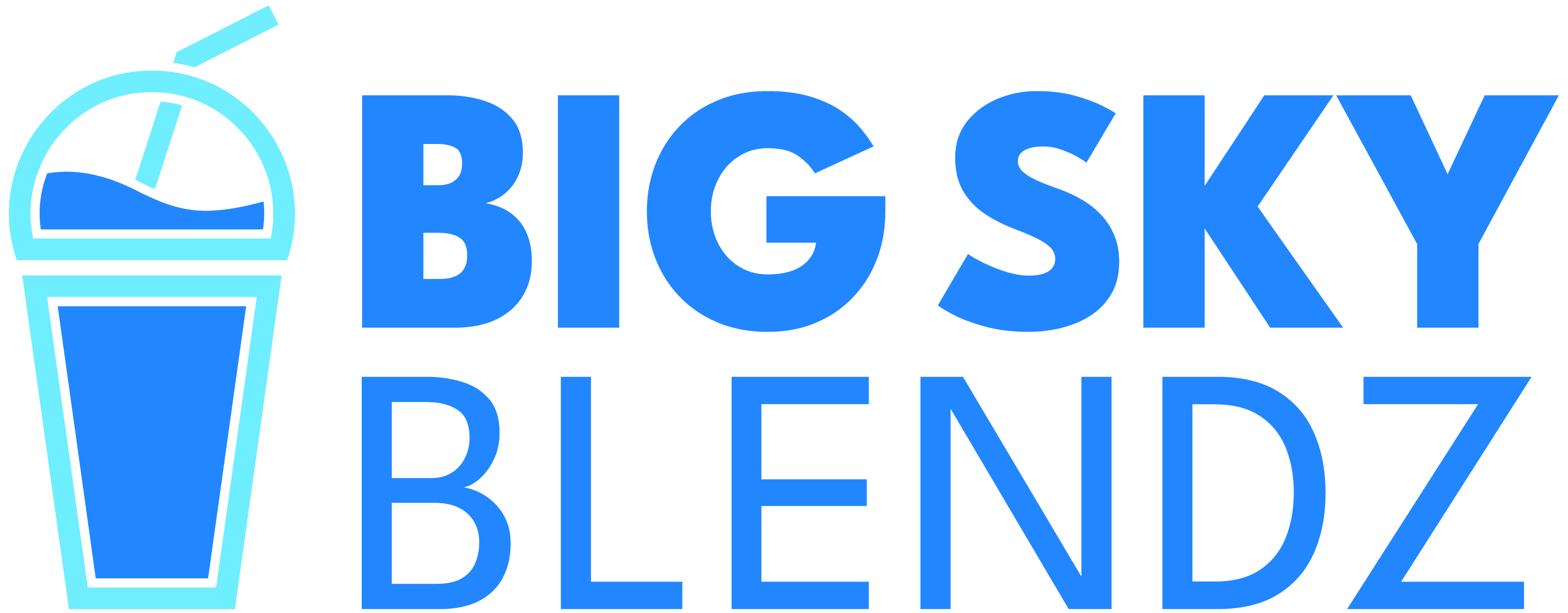
This is my version of the Blendz logo with my branding. With my design, both the logos can both stand alone but resemble each other. Additionally both logo marks have a similar shape.

The primary colors for Big Sky Fitness are the light and dark blue. Pinks and Oranges are secondary, since they represent sun set. Greens are tertiary, since compliments the other three colors.
Blendz has an additional
two colors. Cream and Brown. Big Sky’s mark doesn’t use them since they are too closely resemble skin colors.
Business Cards
To make the business cards
to stand out I used the
main colors for the
background. The pattern
uses the mark to show
people helping hold each
other up.
Big Sky’s new tagline would be “Don’t just reach for the sky. Lift it.” An encouraging addition to the common
phrase “Reach for the Sky.”


A smoothie using the orange Blendz logo

A sellable protein/blender bottle
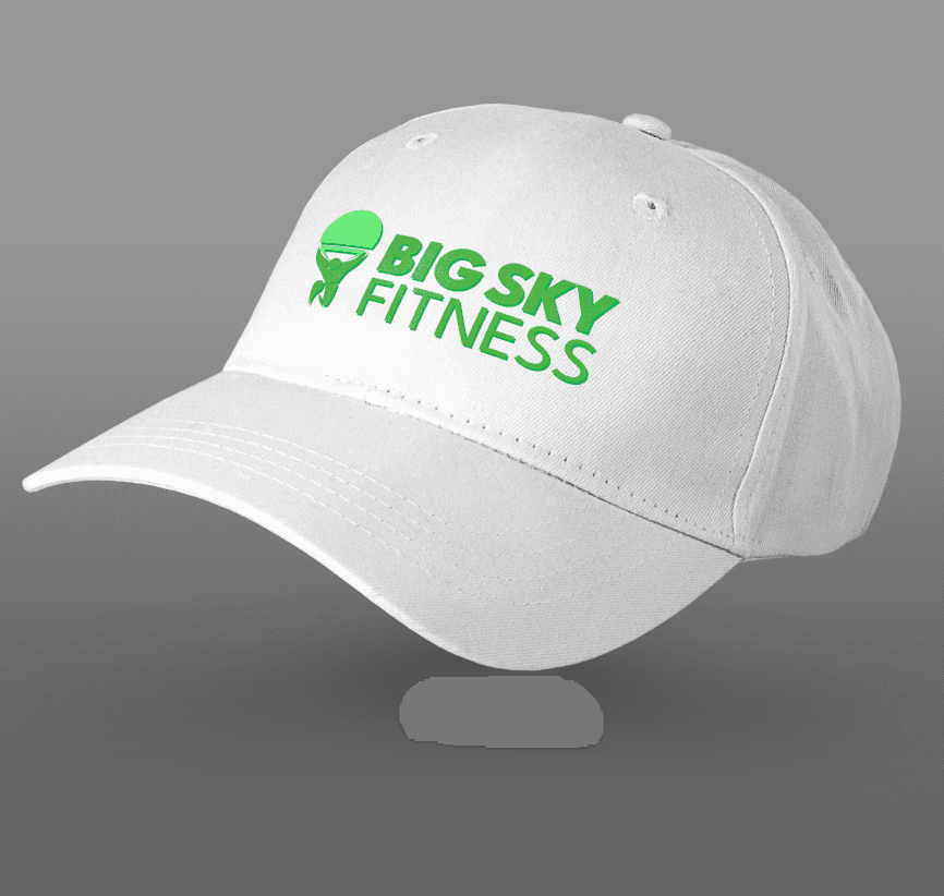
A simple idea for a sports cap
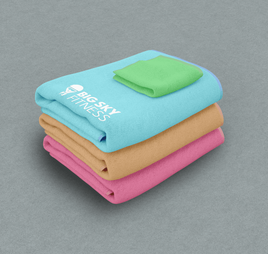
Towels come in all the main colors of the brand

© 2024 Justin Stochel
jstocheldesign@gmail.com