

BLITZ ZUG
LOGO
BRANDING
For Blitz Zug I was tasked with designing for a new train company utilizing magnetic levitation technology, for a foreign country. The country I was tasked to design for was Germany.

Since the country I got was Germany, I decided to design the brand in German as I felt it made the
most sense for the primary audience.
Adjustments
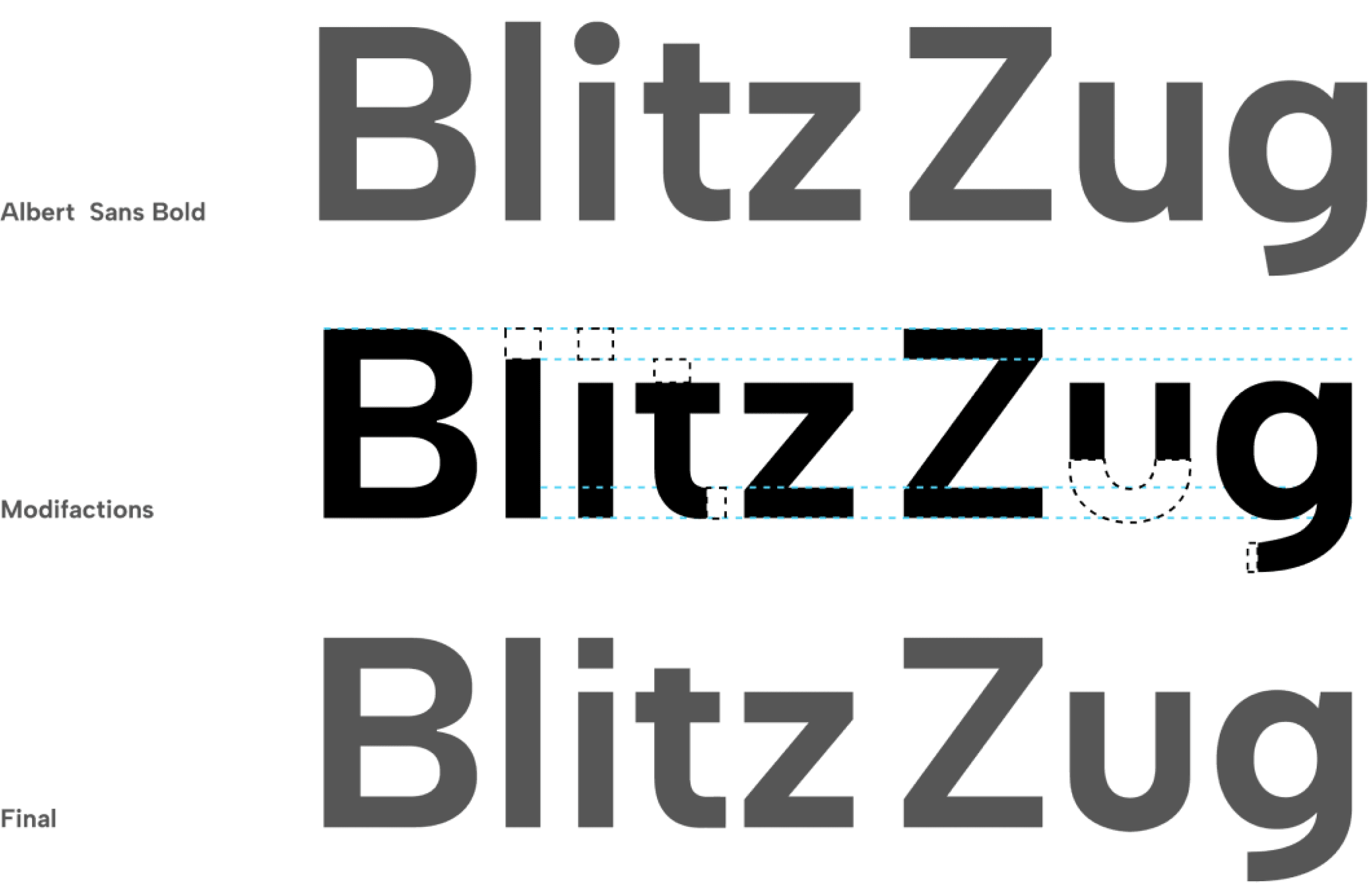
Font Modifications
The cap height of all letters where brought to the same level. The tittle in the i clashed with the very straight lines of the letters around it, so I squared it off. The cap height of the t was lowered to align with part of the uppercase Z. The terminal of the t was straightened to fit with the lower case z. The spur of the u was removed since no other letter had one. The tail of the g received similar treatment to the t. These modifications along with special kerning helps make the logo feel more cohesive. These choices also help make the design a mixture of professional and fun.
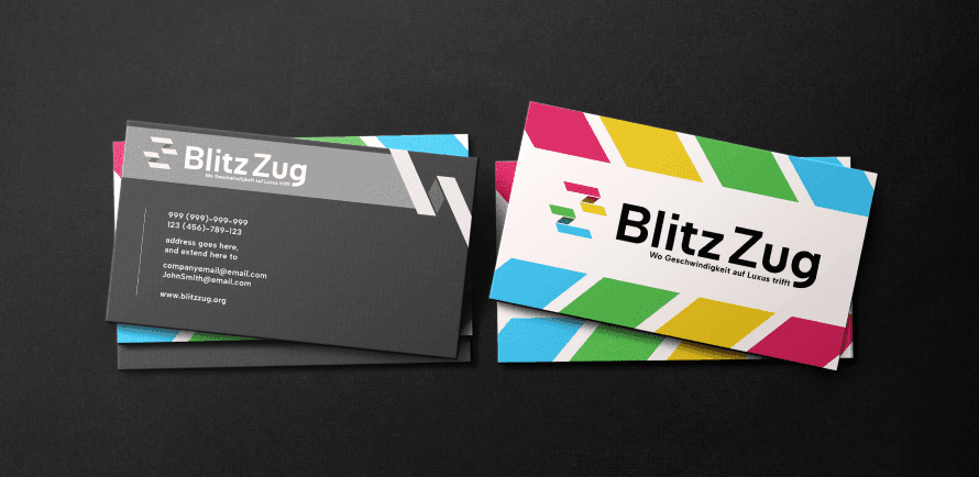
Business Cards, the tagline is German for “Where speed meet’s luxury.”
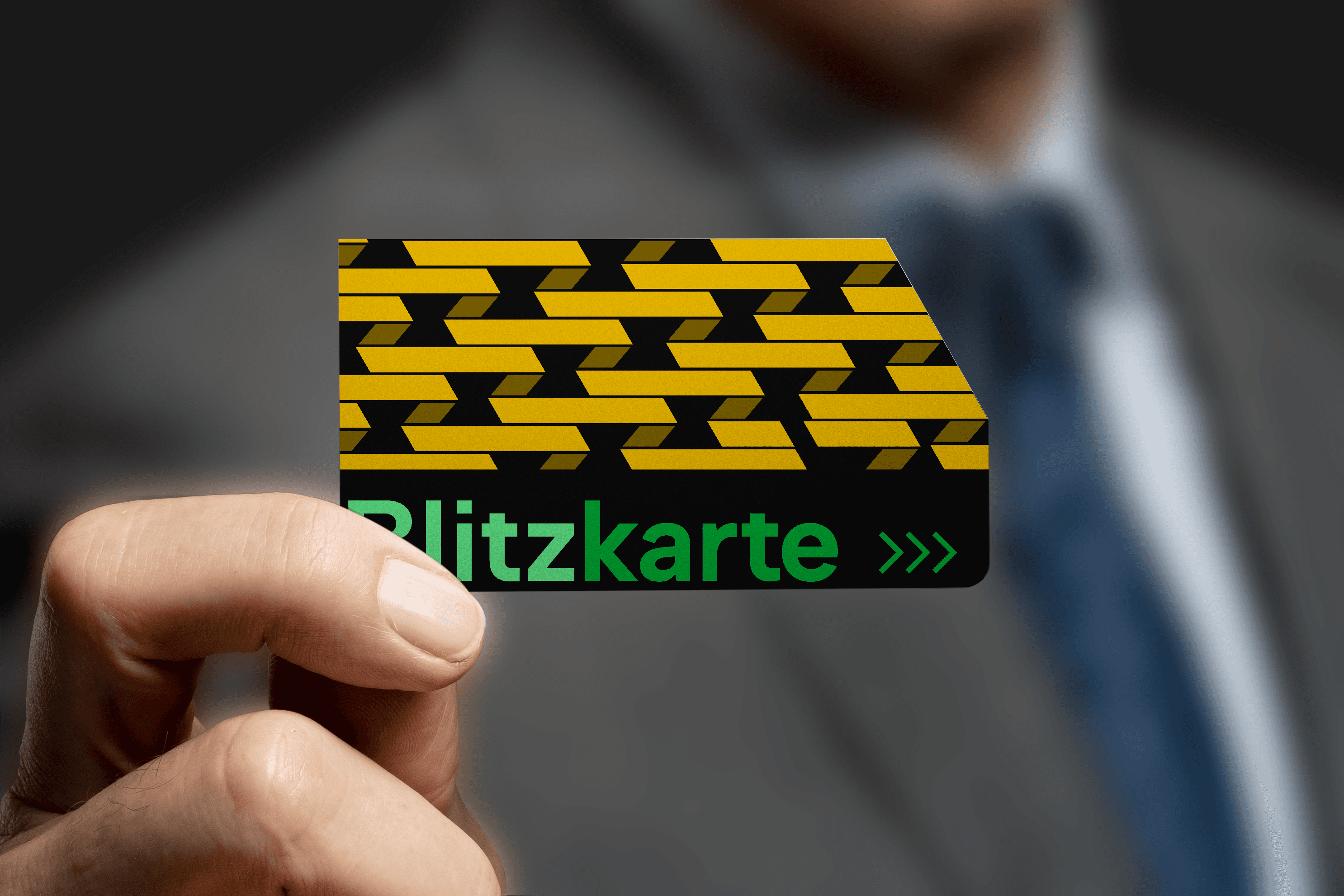
The Blitzkarte which translates to lighting card is for those who frequent the train a lot and do
not want to purchase tickets each time.
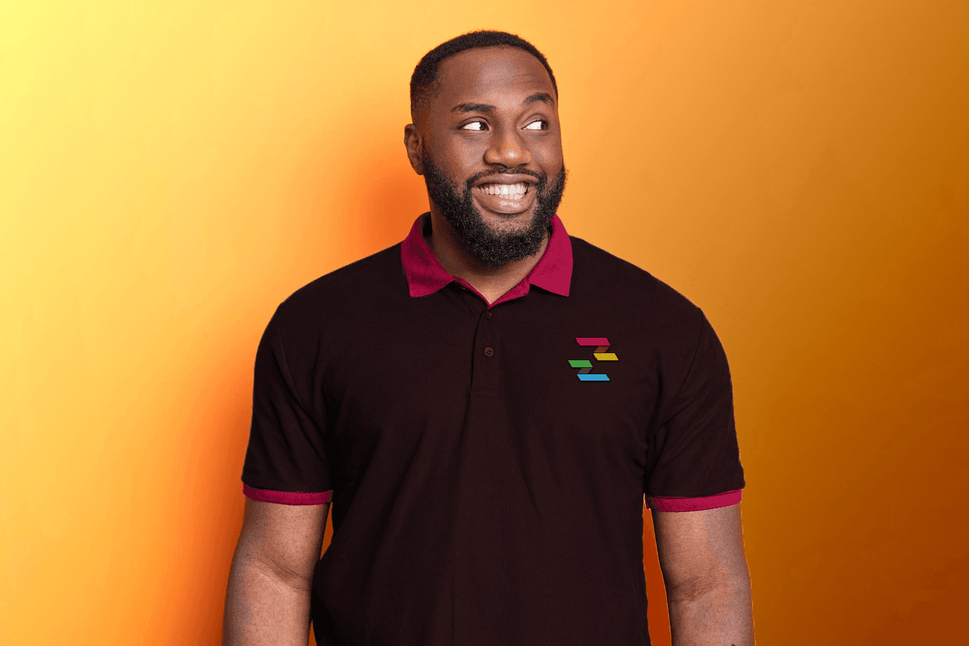
This outfit could be a potential uniform for the employees using the brands brown color for the base of the shirt.

Sample of a kiosk in use to buy tickets or use
the tickets.
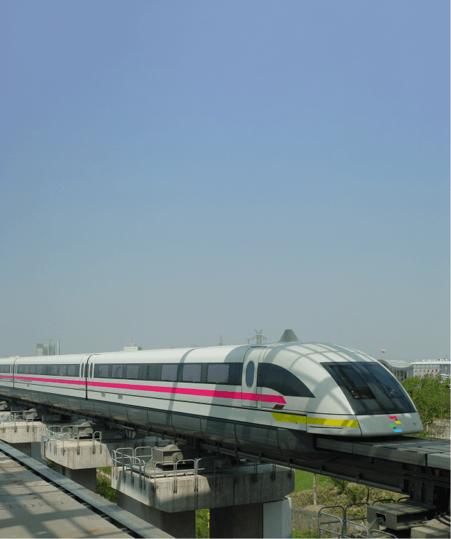
Design of one of the trains
Blitz Zug Experience
The research I conducted showed that many Germans prefer to drive rather then take the train. Blitz Zug’s goal is to provide a more luxurious and cozy experience to persuade individuals to take the train rather than drive. This experience would provide some free goodies when the passenger buys a ticket.
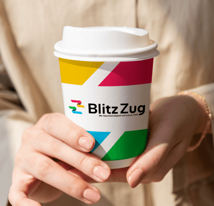
Here is the branding on a cup that can serve varying beverages.
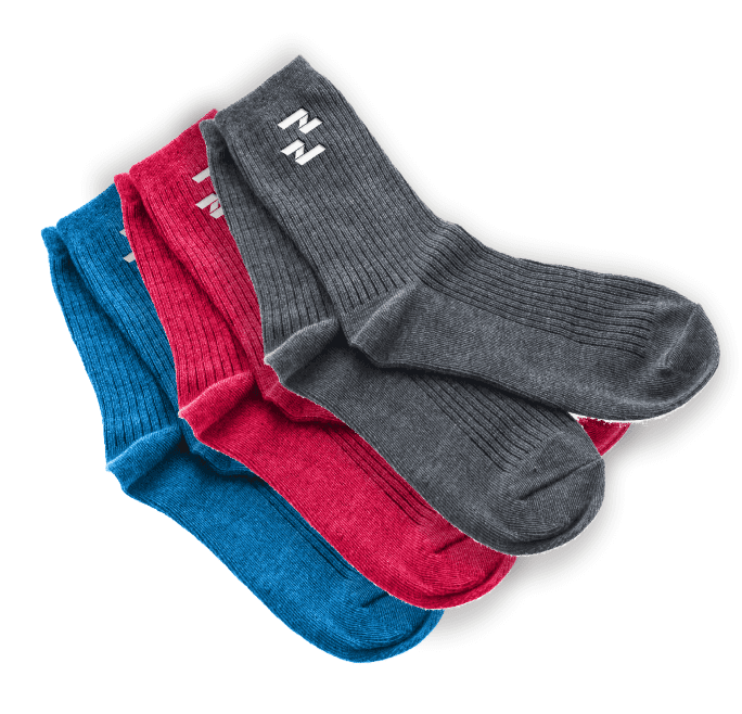
These soft socks can be nice to wear especially for longer train rides.

This bag can help store all of the personal belongings for the train ride.

© 2024 Justin Stochel
jstocheldesign@gmail.com
© 2024 Justin Stochel
jstocheldesign@gmail.com