

TRAPROCK RIDGE
LOGO
BRANDING
The Traprock Ridge Land Conservancy (Traprock for short) recently merged
three land conversancy together to work more efficiently. This project tasked me
with taking charge of the rebranding of this organization, and printed materials.


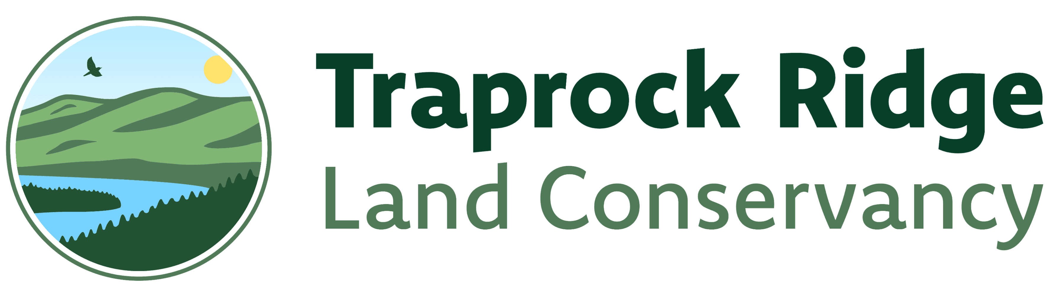
I decided to make three logo variations for Traprock. The top two are the badge versions. The first has an embroidered texture and the second is the vector format. The bottom design is the more formal version. Traprock is a non-profit so they need to look professional to ensure they raise funds and get donations, but they also wanted a logo that’s more inviting and fun for different events and gatherings. The logo mark incorporates the various parts of nature the organization is protecting.
Branding


Embroidered Hat
Here is an example of what the badge version of the logo would look like on a hat as a patch. This design is meant to be reminiscent of the girl/boy
scout patches that often involve outdoor activities to be earned.
I’m A Trap-Rocker
A campaign we wanted to explore was using the phrasing:
“I’m A Trap-Rocker.” A little pun on the organization’s name while also making those who help contribute feel more of
the team.
This is a sample of a more experimental approach for a T-Shirt design. Designed to be more eye catching, which would hopefully strike up conversations with others, to inform them about Traprock.


Brochure
Traprock needed a brochure to
send out to potential donors,
that showcases the organization’s new merger. It also includes some info on the many properties they have.
The brochure printed was
split into 6 sections each of
which was 8x8 inches.
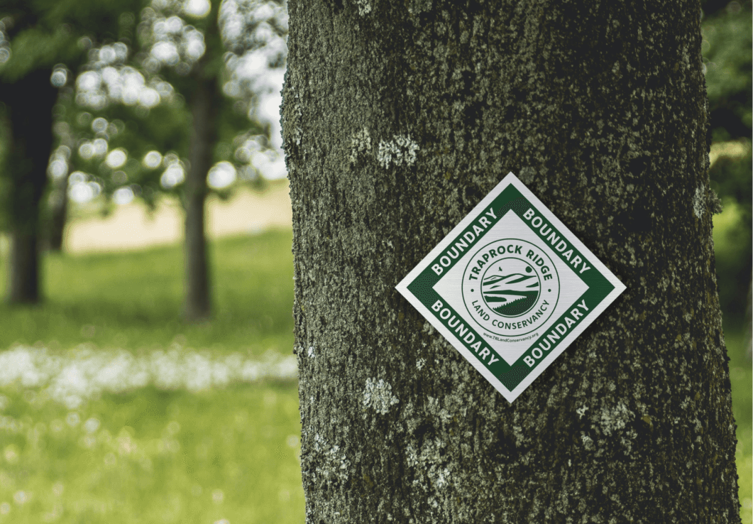
Boundary Signage
A project Traprock asked me to do was to make boundary signs that they could hang on trees on their properties. Traprock needed them to be simple, one color with a link to their website.
VIEW ALL PROJECTS

© 2026 Justin Stochel
jstocheldesign@gmail.com
© 2026 Justin Stochel
jstocheldesign@gmail.com
© 2026 Justin Stochel
jstocheldesign@gmail.com