

Wren Kitchens
BRANDING
MOTION
UI


Benefits of Wren Handout (Front / Back). We utilized extensive messaging at Wren and aimed to include as much as possible on take-home items so customers could learn about everything we offered.
Benefits of Wren Handout (Front / Back). We utilized extensive messaging at Wren and aimed to include as much as possible on take-home items so customers could learn about everything we offered.

Finance Handout (Front / Back). The goal for this handout was to break down the various interest-free financing options we provided for both our Infinity and Infinity Plus lines.
Finance Handout (Front / Back). The goal for this handout was to break down the various interest-free financing options we provided for both our Infinity and Infinity Plus lines.
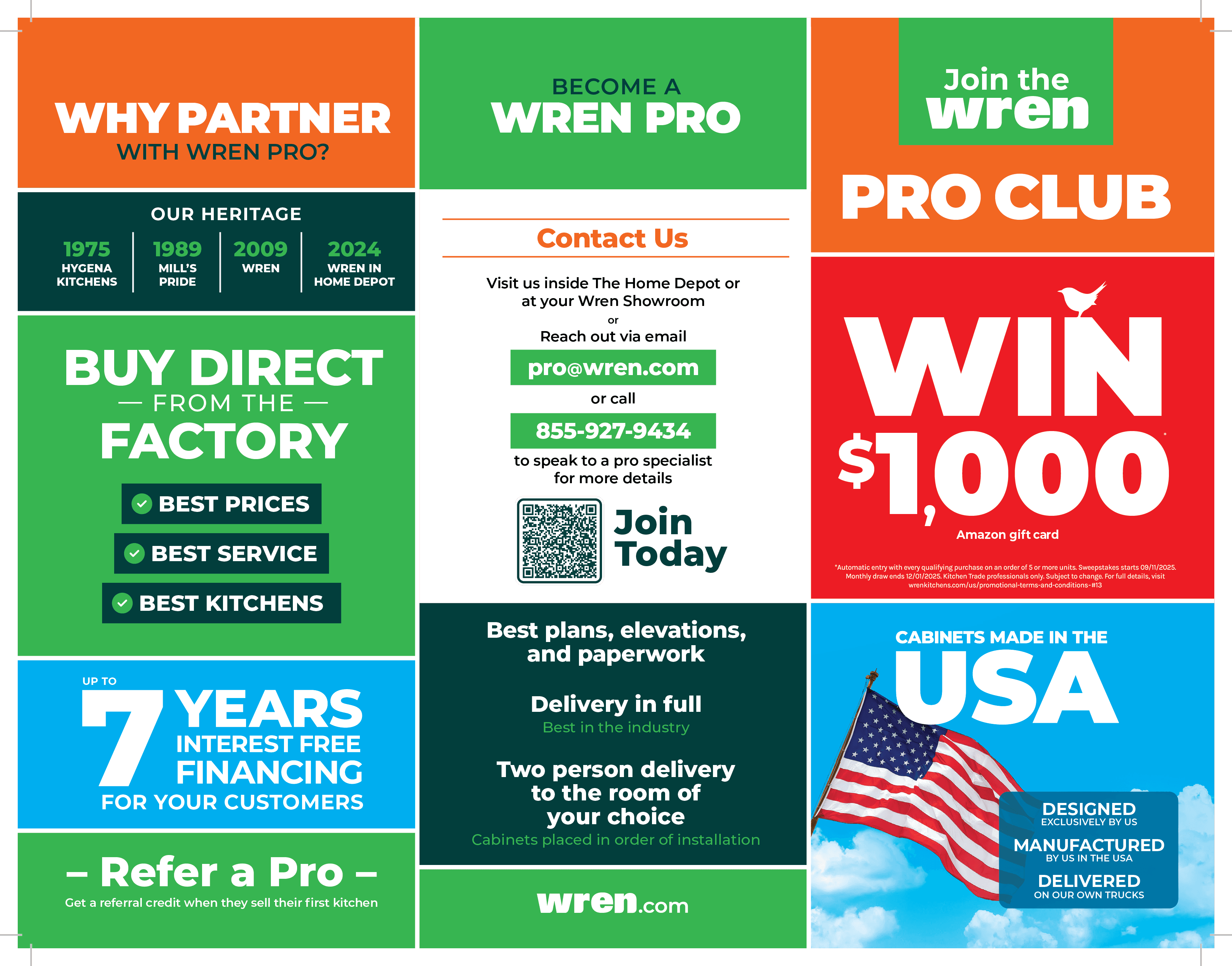
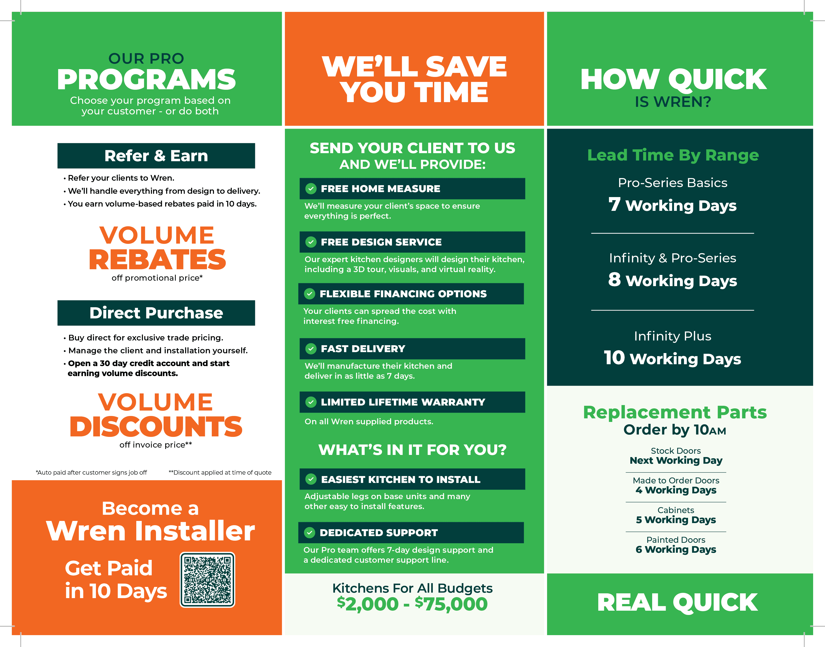


Wren Pro Tri-Fold (Front / Back). While Wren's B2C relationships were a key part of the business, the B2B relationship with The Home Depot and Pros was crucial. This handout primarily served to highlight the benefits, opportunities, and history of Wren for their construction jobs. Individuals in our B2C segment were unlikely to be repeat customers, as the average person only renovates their kitchen once or twice in their lifetime. Pros, however, are repeat customers who often require dozens of kitchens at a time.
We conducted two surveys for A/B testing and asked several of our partnering Pros which messages resonated most strongly with them and what helped 'move the needle' to have them partner with us. This tri-fold was the result of those insights. To further engage this target audience, we also created a Spanish variation of the handout.
Wren Pro Tri-Fold (Front / Back). While Wren's B2C
relationships were a key part of the business, the B2B
relationship with The Home Depot and Pros was crucial.
This handout primarily served to highlight the benefits,
opportunities, and history of Wren for their construction
jobs. Individuals in our B2C segment were unlikely to be
repeat customers, as the average person only renovates
their kitchen once or twice in their lifetime. Pros,
however, are repeat customers who often require dozens
of kitchens at a time.
We conducted two surveys for A/B testing and asked
several of our partnering Pros which messages
resonated most strongly with them and what helped
'move the needle' to have them partner with us. This
tri-fold was the result of those insights. To further
engage this target audience, we also created a Spanish
variation of the handout.
Wren Pro Tri-Fold (Front / Back). While Wren's B2C relationships were a key part of the business, the B2B relationship with The Home Depot and Pros was crucial. This handout primarily served to highlight the benefits, opportunities, and history of Wren for their construction jobs. Individuals in our B2C segment were unlikely to be repeat customers, as the average person only renovates their kitchen once or twice in their lifetime. Pros, however, are repeat customers who often require dozens of kitchens at a time.
We conducted two surveys for A/B testing and asked several of our partnering Pros which messages resonated most strongly with them and what helped 'move the needle' to have them partner with us. This tri-fold was the result of those insights. To further engage this target audience, we also created a Spanish variation of the handout.

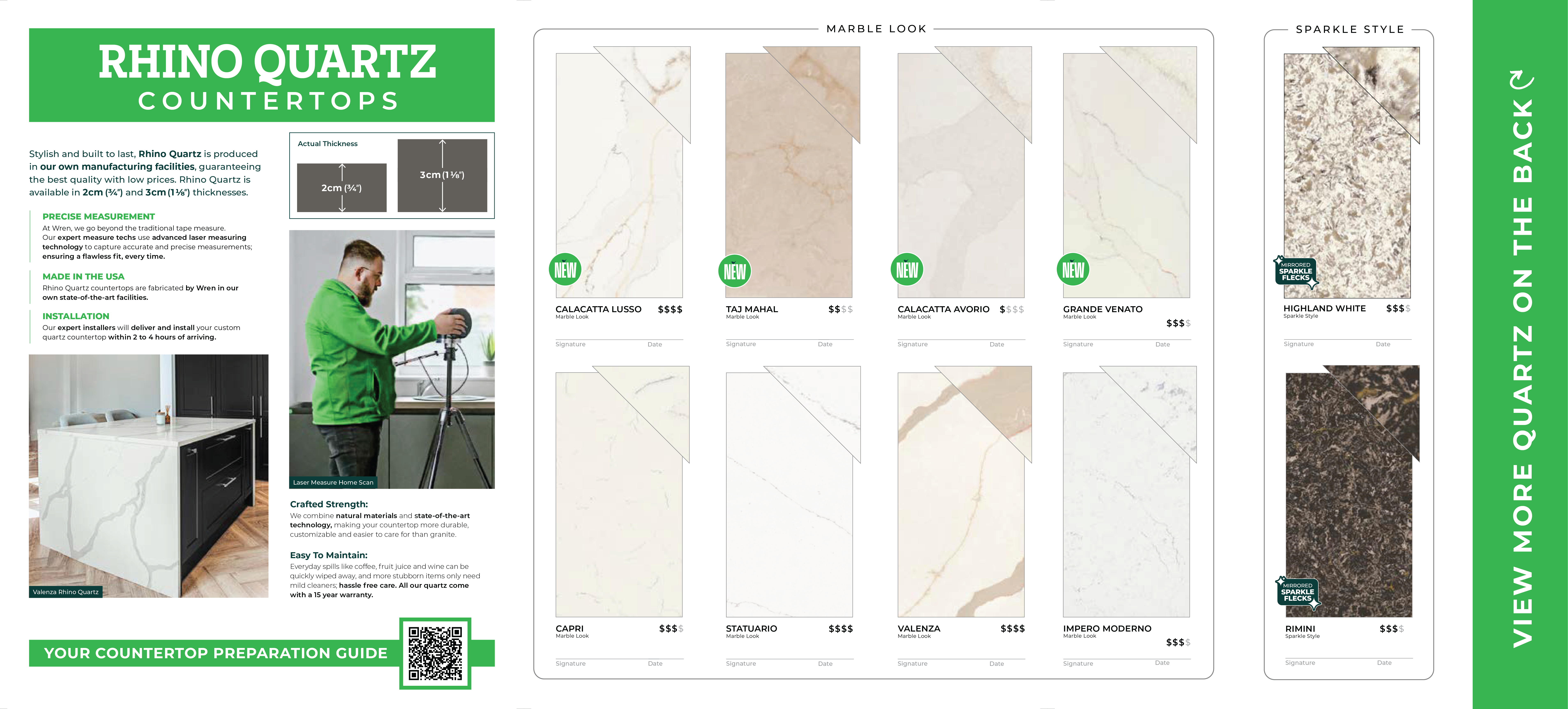
Rhino Quartz Tri-Fold (Front / Back).

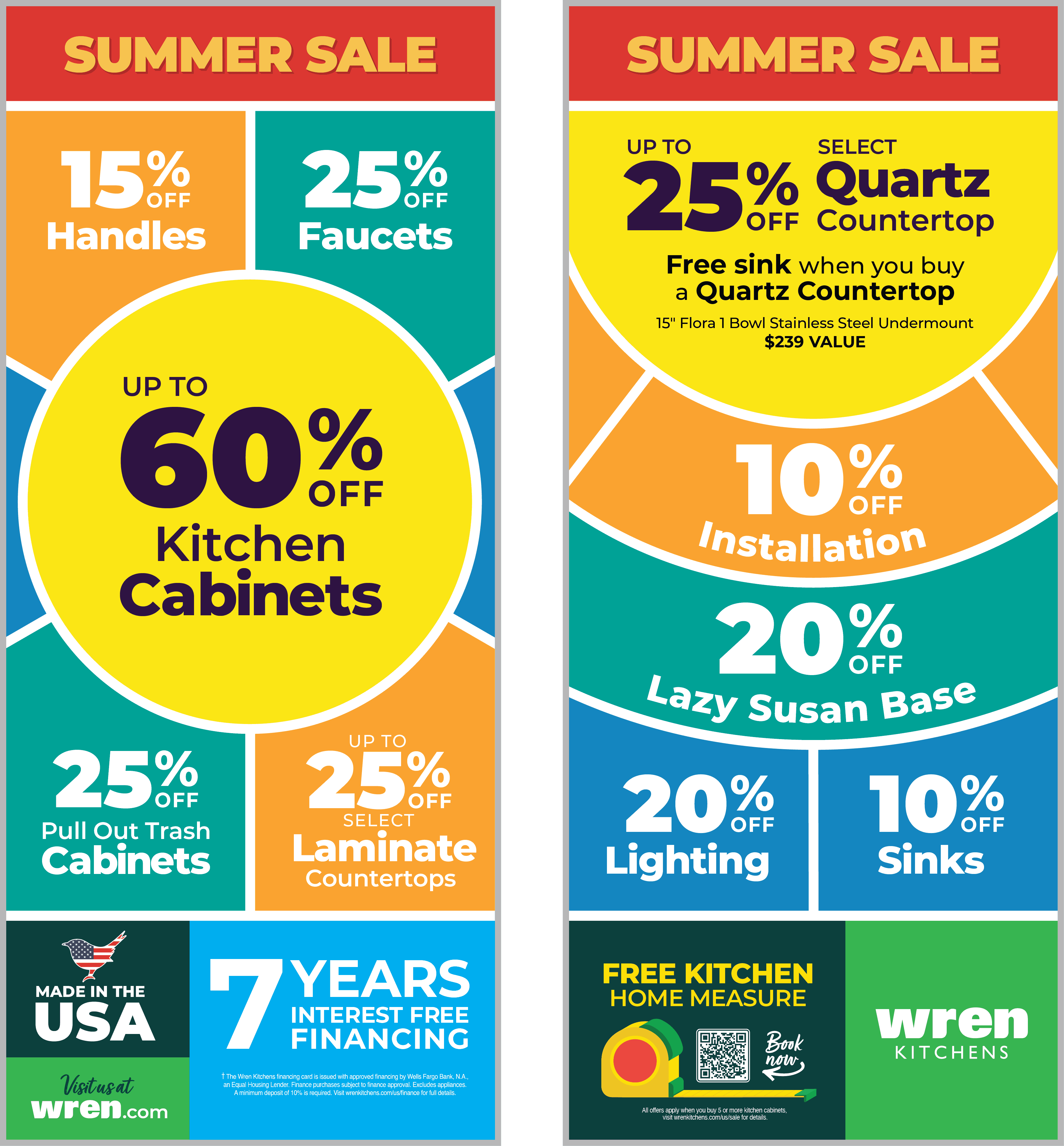
Phase Inserts (Front / Back). These were being phased out when I joined the project, and I worked on the final three. These featured the highlighted deals for each phase (bi-weekly sales) and were inserted into the guidebooks. We wanted to keep them colorful while intentionally avoiding the color palette commonly used in our showrooms.
In 2025, we did not change the name of the sale as frequently as we did in 2026; consequently, multiple phases often shared the same sale name.
Signage
At Wren, I also worked on several interior and exterior pieces of signage, typically produced as boards or adhesive vinyls.
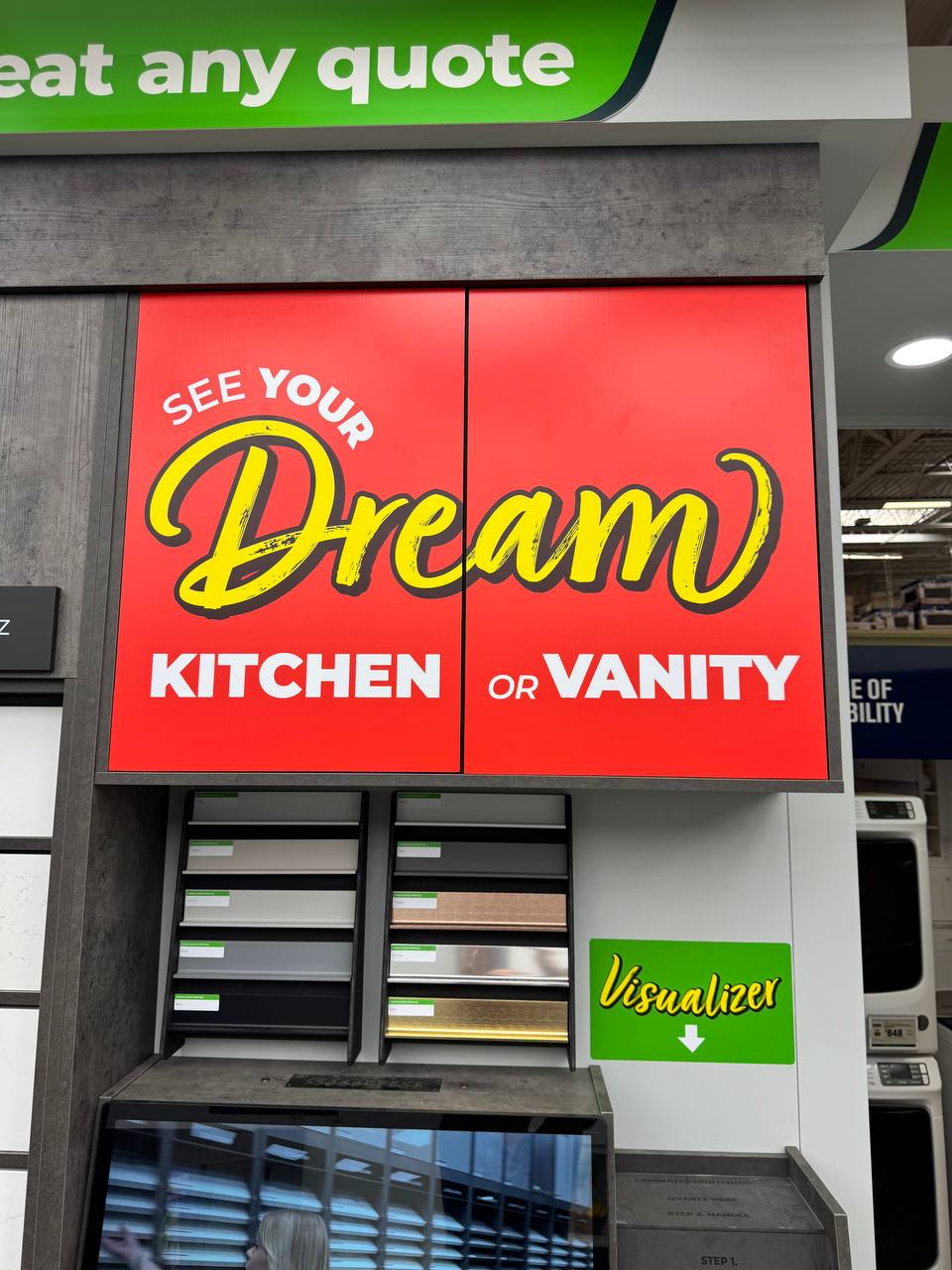
This piece was used to draw attention to the Visualizer, a standout feature in our locations that helps convert casual viewers into leads. By placing physical samples on the table, a preview image of a kitchen with those specific items is displayed on the screen, allowing customers to see in real time how different combinations work together.
At Wren, I also worked on several interior and exterior pieces of signage, typically produced as boards or adhesive vinyls.
This piece was used to draw attention to the Visualizer, a standout feature in our locations that helps convert casual viewers into leads. By placing physical samples on the table, a preview image of a kitchen with those specific items is displayed on the screen, allowing customers to see in real time how different combinations work together.
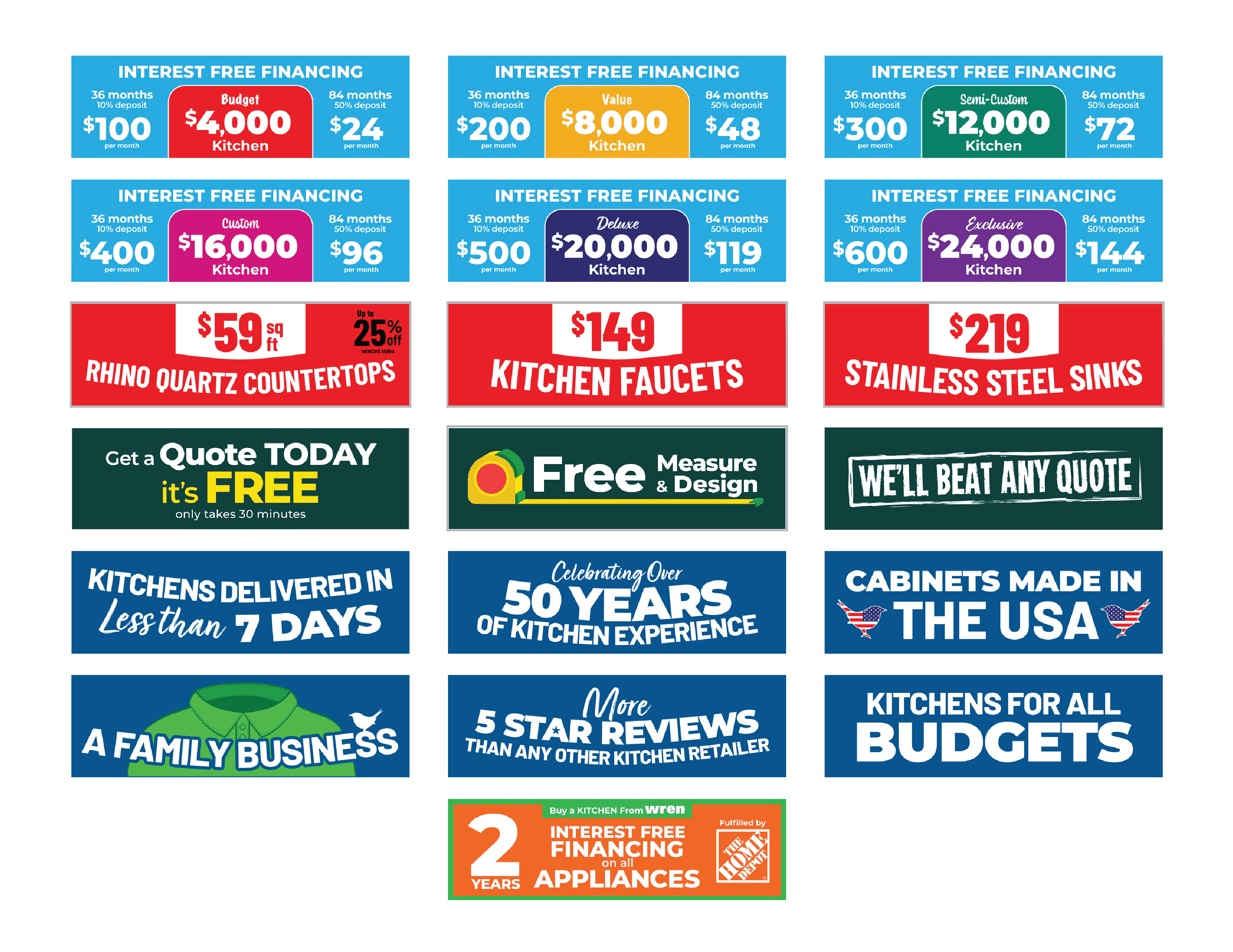

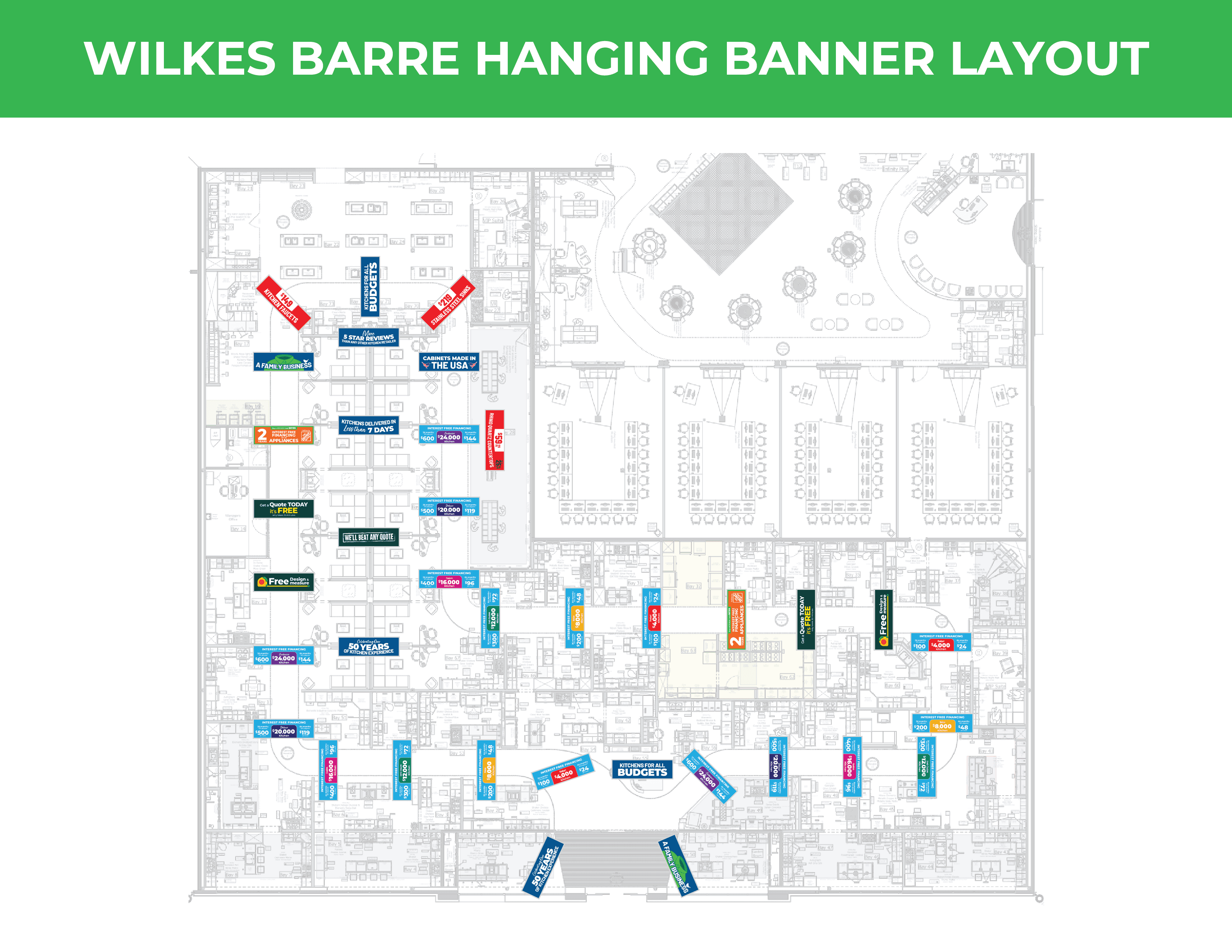
Hanging Banners. I was tasked with designing the hanging banners and developing floor plans for all 17 showroom locations. Each layout was meticulously planned to ensure brand cohesion across various sites, ensuring that banners were positioned within relevant zones while strictly avoiding exit signs and other obstructions.
Provided are two examples of these floor plans. While the showrooms vary in size, the plans have been scaled differently to fit the presentation sheets. Each banner was placed at a minimum interval of 15 feet.
Branding
Starting in 2026, we transitioned to a new branding strategy for our promotional phases. Each phase was given a unique name and custom artwork. The 'Phase Headers' were design elements placed at the top of marketing collateral to highlight active deals.
For exterior signage, we produced 'indents' visual lockups of the phase logo combined with design elements. Two versions were printed for each phase: one stating 'Ends Soon' and another with 'Ends Wednesday.' Below are four unique phases I worked on, each featuring its own custom die-cut.


Motion
Coming Soon!
Design Elements
Design Elements
Coming Soon!
VIEW ALL PROJECTS

© 2026 Justin Stochel
jstocheldesign@gmail.com
© 2026 Justin Stochel
jstocheldesign@gmail.com
© 2026 Justin Stochel
jstocheldesign@gmail.com